Charts
From AgileApps Support Wiki
Revision as of 22:52, 26 January 2012 by imported>Aeric (→Advanced Options for Charts)
Charting options provide the ability to create graphical representations of your data in Reports.
Add a Chart to a Report
- In a new or existing Report, click the [Group] tab
- In the Row Group section, select one or two fields to define grouping
- Charts can contain information grouped by one or two levels
- Column grouping is not used in Charts
- Click the Chart tab and select the type, size and location for the chart you want to display
- Learn more: Customizing Charts
- Enter Title, Size and Legend information
- Click the [Preview] button to check that the chart displays as intended
- Click [Save]
Customizing Charts
The following features are available in charts:
- Choose the chart type: Pie, Doughnut, Funnel, Line, Area, Bar Chart, Meter Gauge
- Choose the data set to include in the chart (X-Axis and Y-Axis)
- Choose the chart size (height and width), title, legend, orientation, location, etc., as appropriate for the chart type
Chart Formats
Available chart formats for Reports:

Pie Chart

Funnel Chart

Vertical Bar Chart
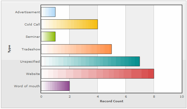
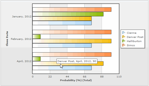
Horizontal Bar Chart
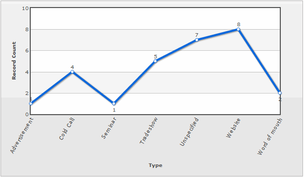
Line Graph
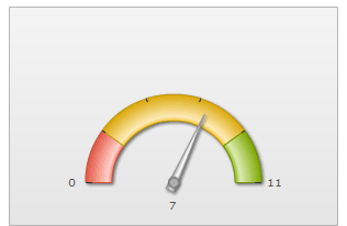
Meter Gauge
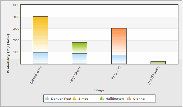
Vertical Stacked Bar Chart

Horizontal Stacked Bar Chart

Vertical Grouped Bar Chart
Horizontal Grouped Bar Chart


X-Axis and Y-Axis in Charts
X-Axis
- The X-Axis displays values horizontally (left-right).
- X-Axis options in charts are defined via the Group tab
To select X-Axis Options:
- From the Fields tab, select fields to display in the report
- From the Group tab, use the Row Group section to create X-Axis options
Y-Axis
- The Y-Axis displays values vertically (up-down)
- Y-Axis options in charts are defined via the Compute tab
To select Y-Axis Options:
- From the Compute tab, click the checkbox
 icon to select available Y-Axis field(s)
- Fields that have a Numeric Return Type (i.e., Number (integer or decimal), Percent or Currency) are displayed in the Compute grid, and become available as Y-Axis options
- The options for these fields are Total, Average, Minimum, and Maximum
Advanced Options for Charts
The choices in the Advanced Options section depends on the type of chart.
Common Options
These options are available in every chart:
- Title: Chart Title
- Size: The chart size: Small, Medium, Large or Custom
- If Custom is selected:
- Height: Height of the chart, in pixels
- Width: Width of the chart, in pixels
Options for Line, Area, and Bar Charts
- Chart Location: Above or Below the data table
- Chart Font: Style of the font used in the chart
- Chart Font Size: Size of the font used in the chart
- Value Labels: Show or hide the labels
- X-Axis Label: Show or hide the label
- Y-Axis Label: Show or hide the label
- Y-Axis Ticks: The number of ticks displayed
- X Axis Tick Angle
- Y-Axis Maximum Range: The largest value displayed on the Y-Axis
- Y-Axis Minimum Range: The smallest value displayed on the Y-Axis
Additional Options for Line Charts
- Trend Line: Show, Hide
- Markers: Show, Hide. Empty or filled Circle, Diamond, or Square
- Shadows: Show or hide shadows
Additional Options for Area Charts
- Markers: Show, Hide. Empty or filled Circle, Diamond, or Square
- Shadows: Show or hide shadows
Additional Options for Bar Charts
- Bar Color: Different color, Same color
- Determines whether each bar in the chart displays with the same or a different color
- Y Axis Number Format: Shown for vertical bar, line, and area charts
- Options:
- %% - a percent sign
- %c - a character with the given number
- %s - a string
- %d - a signed integer, in decimal
- %u - an unsigned integer, in decimal
- %o - an unsigned integer, in octal
- %x - an unsigned integer, in hexadecimal
- %e - a floating-point number, in scientific notation
- %f - a floating-point number, in fixed decimal notation
- %g va floating-point number, in %e or %f notation
- X Axis Number Format: Shown for horizontal bar charts
- Options: Same as those show for Y Axis Number Format, above
- Bar Width (px): Width of each bar, in pixels
- Bar Padding (px)
- Bar Margin (px)
- Y Padding
- X Padding
- Edge Tolerance
- Display value as stacked
- Hide Zero Point Labels
- Point Label Location
Meter Gauge Options
- Chart Location: Above or Below the data table
- Value Labels: Show, Hide
- Gauge Start Value
- Gauge End Value
Options for Pie, Doughnut, and Funnel Charts
- Chart Location: Above or Below the data table
- Chart Labels: Show Values, Show Percentages, None
- Chart Border: Show or hide the chart border
- Chart Label Position: Offset of each label from the corresponding chart segment, in pixels. (Not an option for a funnel chart)
- Shadows: Show or hide shadows
- Legend Position: Left, Right, Bottom, Hide
- Legend Placement Outside Grid, Inside Grid, Outside,
- where the "grid" is the box the chart is displayed in.
- Legend Columns: The number of columns in the legend