Difference between revisions of "Viewing Cases"
imported>Aeric |
imported>Aeric |
||
| Line 88: | Line 88: | ||
The image color then changes to reflect the case status, to distinguish it from temporary icons, and it contains an "X" instead of the pin. Click the "X" to remove the icon from the display area. | The image color then changes to reflect the case status, to distinguish it from temporary icons, and it contains an "X" instead of the pin. Click the "X" to remove the icon from the display area. | ||
:[[File:CasePinned.png]] | :[[File:CasePinned.png]] | ||
<noinclude> | |||
[[Category:Usage]] | |||
</noinclude> | |||
Revision as of 23:22, 13 May 2013
Case Agents will spend the majority of their time in the Cases tab. This article explains what you're seeing, and tells you to control your view.
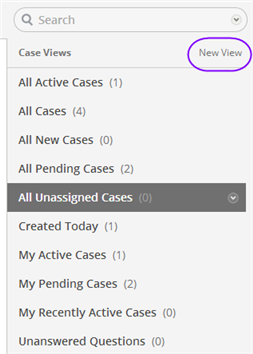
Viewing a List of Cases
Searching for Cases
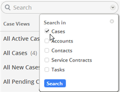
When you put a value in the search field and click the magnifier , you get search results from across a variety of objects. You can also click on the down arrow to restrict the search:
Click the checkbox next to Cases and then click [Search] to limit the search results to Case records.
Case Colors and Priorities
In the case list, the cases are color coded:
Case Numbers
A number to the left of a case indicates the number of recent communications that have been received concerning that case.
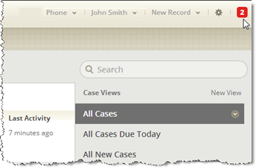
A similar number occurs at the top edge of the screen. That value is the number of recent incoming communications for all cases. Click it to see a list of cases that received those communications, then click a link in that list to go to a case:
Working with a View
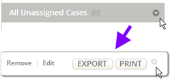
Clicking the down arrow next to the selected view presents you with a series of options related that view:
With those options, you can remove the view, edit it, export it's contents to a comma-separated values (CSV) list, or print the records.
Visiting a Case
You click on a case to view it. When it displays, the Case banner uses the same color coding that appeared in the Case List:
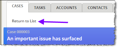
When done working with the case, click Return to List to go back to the Case List view:
(Since this particular case is in progress, rather than pending--or waiting on input from someone else--the banner displays with a solid color.)
Pinning a Case
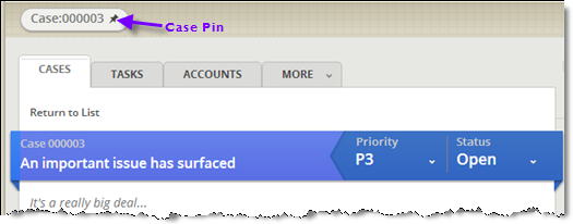
When viewing a case, a case icon with a "pin" in it appears above the tabs.
You can now return to the case list or go to other tabs, and return to the case whenever you want by clicking that icon.
If you visit a different case, however, the case icon is replaced with one that points to the case you are currently visting. To keep the original case icon around, click the "pin" in the icon. Doing that fixes the icon so it stays in place, even when you visit a different case.
The image color then changes to reflect the case status, to distinguish it from temporary icons, and it contains an "X" instead of the pin. Click the "X" to remove the icon from the display area.
