Difference between revisions of "New Designtime User Interface for AgileApps"
Wikieditor (talk | contribs) |
Wikieditor (talk | contribs) |
||
| Line 21: | Line 21: | ||
==Enabling the New User Interface for AgileApps for Existing Tenants== | ==Enabling the New User Interface for AgileApps for Existing Tenants== | ||
{{Note| For all new tenants that you create, the new run time and design time UI | {{Note| | ||
:* For all new tenants that you create, the new run time and design time UI are enabled by default. | |||
:* The new user interface includes both the new run time UI and the new design time UI.}} | |||
For existing tenants, the new user interface is applicable as mentioned here:<br> | For existing tenants, the new user interface is applicable as mentioned here:<br> | ||
Revision as of 08:13, 8 February 2023
Overview
You now have a new and improved design time user interface for AgileApps which is in sync with the new runtime user interface that was introduced earlier. The purpose of making design time changes is to improve the user experience and make the platform or the application more visually appealing and user-friendly. These changes include modifications to the layout, colors, font type/size/weight, and other visual elements of the platform. You can expect to see a refreshed and updated look and feel of the platform. The changes may be subtle or more significant, depending on the nature of the modifications.
Here are a few points to be noted:
- By default, the new run time and design time user interface are shown in AgileApps upon new tenant creation.
- Existing users of AgileApps have the option to switch to the new UI using the Company Information settings.
- After they confirm that all their functionalities are working in the new UI, they can activate it for all their users.
With this new design time UI, you have the following benefits:
- Accessibility - This interface conforms with the global accessibility standards.
- Browser support - This interface is supported on all the latest versions of Firefox, Chrome, and Internet Explorer Edge browsers.
- Security - The new user interface is more secure than its predecessor.
- RTL support - Right to left support is included to support locales where a user reads from right to left.
- Responsive application - The new user interface is better equipped to support more devices and multiple screen resolutions.
Impact on its Usage:
The design time changes should not affect the functionality or usability of the platform or applications. You should still be able to complete the same tasks and access the same features as before. If there are any changes to the functionality or usability, that will be documented and communicated to you well in advance.
Learn More:
For information about the new runtime UI, refer to the New Runtime User Interface for AgileApps page.
Enabling the New User Interface for AgileApps for Existing Tenants
For existing tenants, the new user interface is applicable as mentioned here:
- 1. Click Configuration > Administration > Account Management > Company Information.
- 2. Go to User Interface Settings.
The following table provides the details for these settings:
- 3. Hide Configuration - Select this checkbox to hide the configuration icon in the new runtime UI. This Configuration icon
 is available in the Preview mode as well.
Mobile Access to the New Designtime UI
- By default, the Mobile Access capability should be granted in Manage Tenant capability for both new tenants and existing tenants.
- In the mobile access, the default login page is the new runtime UI login page for both sub-domain enabled and sub-domain disabled tenants. If Activate New User Interface is enabled, you are taken to the new runtime UI and when navigated to designtime UI, you will see the new user interface. If not, you will see the legacy UI.
- For all the new tenants, accessing the application from a mobile device takes them to the new interface as Activate New User Interface is enabled by default.
What to Expect from the New User Interface?
Design time changes to the UI are made with the goal of improving the user experience. End-users can expect to see a refreshed and updated look and feel of the application, without any significant impact on its functionality or usability. Feedback is welcomed and appreciated.
- Removed unnecessary white space and borders, and widened the page layout.
- Followed the uniformity in fonts across the platform with the following specifications:
- Font Type: Roboto, Arial, and Sans-serif
- Font Size: 14px as the standard one.
- Font Weight: 400 (normal)
- Moved the sidebar or the right navigation pane to the left as per UX standards.
- Made the buttons look similar to the ones present in the runtime UI.
- Removed the redundant buttons that were present at the top and bottom of the design time UI forms.
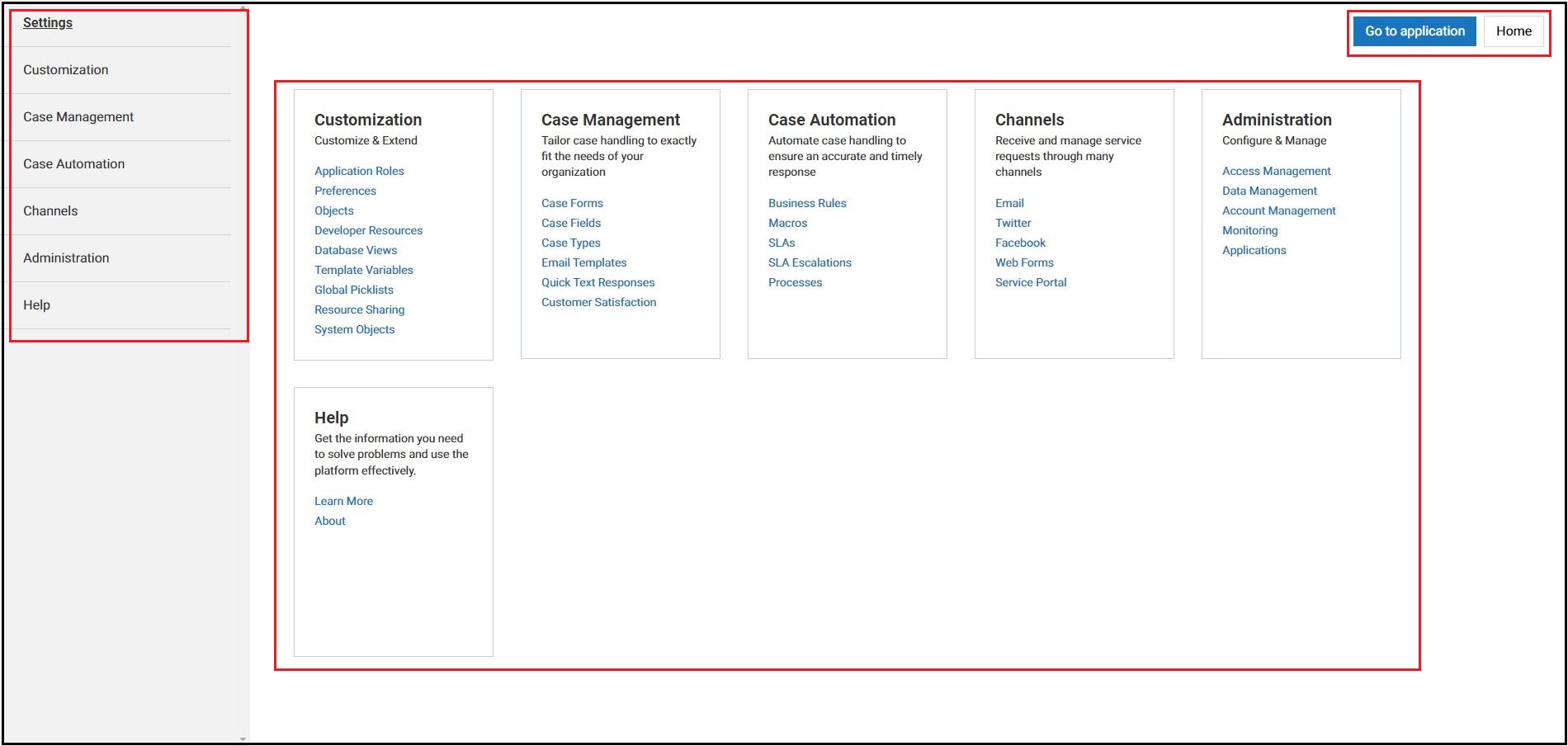
The following screenshots present the new look of the design time user interface:
- The Configuration page with the following modifications:
- The Go to application and Home buttons are placed on the top right part of the page with their size and colors kept as per UX standards.
- The sidebar or the right navigation pane is moved to the left as per UX standards.
- The page layout is widened and the various tiles are placed uniformly to use the entire space available on the page.
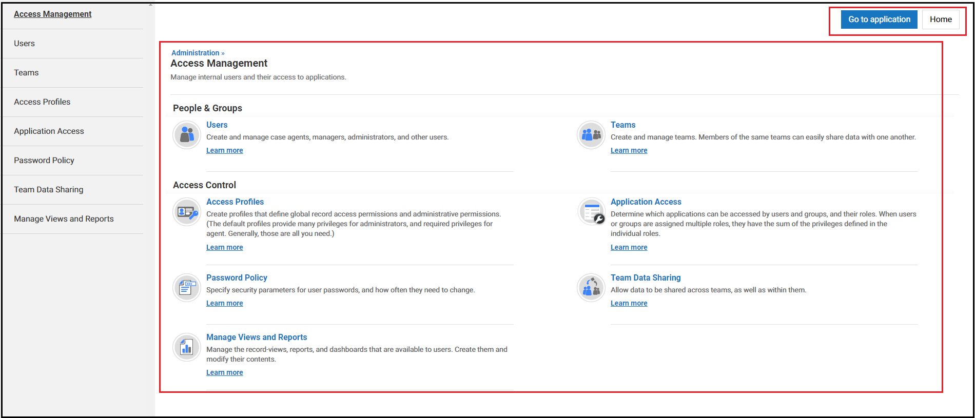
- In each of the configuration pages, for example - Access Management, the menu items are placed uniformly to use the entire space available on the page. The Learn more buttons are replaced with hyperlinks.
- The Default Layout page while creating forms now has the widened page layout with the left navigation pane, use of standard buttons, and so on.
- In pages like Customization > All Roles, upon hovering over the spanner icon next to All Roles on the top of the page displays the options to select the new view, edit, and delete views.
- The Configuration page with the following modifications:


